Best overall: warm off-white. Best for warm-toned tile: pale greige. Best for a cool, understated accent: dusty blue. The best paint colors for small bathroom remodels in 2026 work with your existing finishes and lighting; First Choice Renovation LLC is a service option for Casa Grande homeowners planning bathroom remodeling alongside repairs or broader renovations.
- Warm off-white leads the best paint colors for small bathroom remodels when you want a quiet, adaptable backdrop.
- Pale greige complements warm tile; dusty blue suits a cooler bathroom palette.
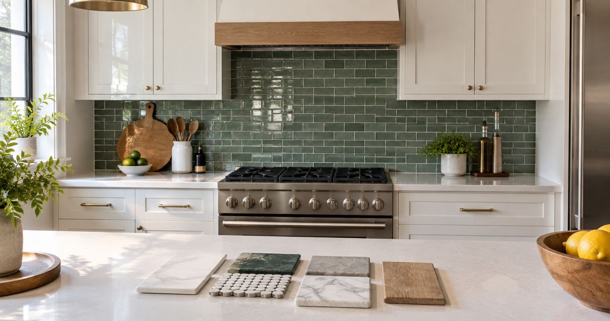
- Compare bathroom paint samples beside your tile, vanity, and countertop under the lighting you actually use.
- First Choice Renovation LLC handles bathroom remodeling, maintenance, and larger residential or commercial renovations.
Why this matters
A small bathroom puts wall paint close to nearly every other finish. A white that looks neutral on a sample card can look yellow beside a cool countertop or gray beside cream tile. Choosing the wall color separately from those materials creates an avoidable mismatch.
For your 2026 remodel, settle the fixed finishes and lighting before approving the final paint color. Paint changes the backdrop, not the floor area. A successful choice makes the room feel coordinated without asking color to compensate for awkward storage, damaged surfaces, or poor lighting.
What makes the best small-bathroom paint color?
Use these criteria before choosing a color family:
- Undertone compatibility: Compare the paint with your tile, countertop, vanity, and fixtures. Warm and cool finishes need deliberate coordination.
- Actual lighting: Judge samples with daylight, if present, and with the bathroom lights switched on. Neither condition tells the whole story alone.
- Visual continuity: Decide whether you want walls to blend with the room or provide an intentional contrast.
- Maintenance fit: Select a coating suitable for the wall surface, moisture exposure, and cleaning needs. Color alone does not determine durability.
- Scope of work: Distinguish a paint refresh from a remodel that replaces fixtures, repairs walls, or changes the layout.
Light reflectance value, or LRV, describes how much visible light a surface reflects on a scale from 0 to 100 points. The theoretical endpoints represent 0% and 100% reflected light. Use that information to compare samples, not to predict how spacious a finished bathroom will feel.
Best bathroom paint colors at a glance
These are color families, not named paint products. The ranking gives each family a distinct role, so you can choose by your bathroom's finishes rather than chase a single fashionable shade.
| Rank and color family | Best for | Standout feature | Key limitation |
|---|---|---|---|
| 1. Warm off-white | An adaptable default | A light backdrop with gentle warmth | Can clash with cool white finishes |
| 2. Pale greige | Warm stone or beige tile | Bridges gray and beige elements | Some shades reveal pink or green undertones |
| 3. Soft sage | Earthy finishes and wood | Adds restrained green color | Needs careful matching with existing green undertones |
| 4. Dusty blue | Cool white or gray finishes | Introduces muted blue without a vivid accent | Can feel overly cool beside warm materials |
| 5. Light taupe | Warm, softly contrasted rooms | Offers more depth than off-white | Can darken visually in limited light |
| 6. Soft charcoal | A deliberate focal wall | Creates strong contrast with lighter finishes | Does not suit a low-contrast scheme |
| 7. Crisp white | Clean-lined, minimal bathrooms | Keeps the palette simple | Exposes mismatches between different whites |
1. Warm off-white: best for an adaptable bathroom backdrop
Warm off-white is the default recommendation for a small bathroom when you want the walls to support the finishes rather than dominate them. It provides a light background with a softer character than a stark white. The exact undertone still matters.
Compare the sample directly with the vanity top and the largest tile surface. If the paint suddenly looks yellow next to either material, choose a different off-white rather than hoping the mismatch disappears across a whole wall.
Warm off-white pros:
- Provides a quiet backdrop for wood, tile, and metal finishes.
- Supports a low-contrast palette when adjacent materials share its warmth.
- Leaves room for color in towels, artwork, or accessories.
Warm off-white cons:
- Can look cream-colored beside cooler whites.
- Does not solve insufficient lighting or surface damage.
Best for: Homeowners seeking a restrained, adaptable bathroom palette in 2026.
Verdict: Choose warm off-white as your starting point, then confirm the undertone in the room.
2. Pale greige: best for existing warm-toned tile
Pale greige combines gray and beige influences. It is useful when a bathroom already contains warm stone-look tile or beige surfaces that you are keeping. A compatible greige connects those materials without simply repeating their color.
Keep the sample beside the tile's background color, not only its veining. A shade that matches a small decorative detail can still conflict with the surface that occupies most of the room.
Pale greige pros:
- Connects beige and gray elements within one palette.
- Adds definition beside compatible white trim.
- Offers a neutral alternative to an all-white bathroom.
Pale greige cons:
- Pink, violet, or green undertones can become noticeable beside fixed finishes.
- A deeper shade changes the room's overall contrast.
Best for: Remodels retaining warm tile or a beige countertop.
Verdict: Choose pale greige when your retained materials already establish a warm neutral direction.
3. Soft sage: best for wood and earthy finishes
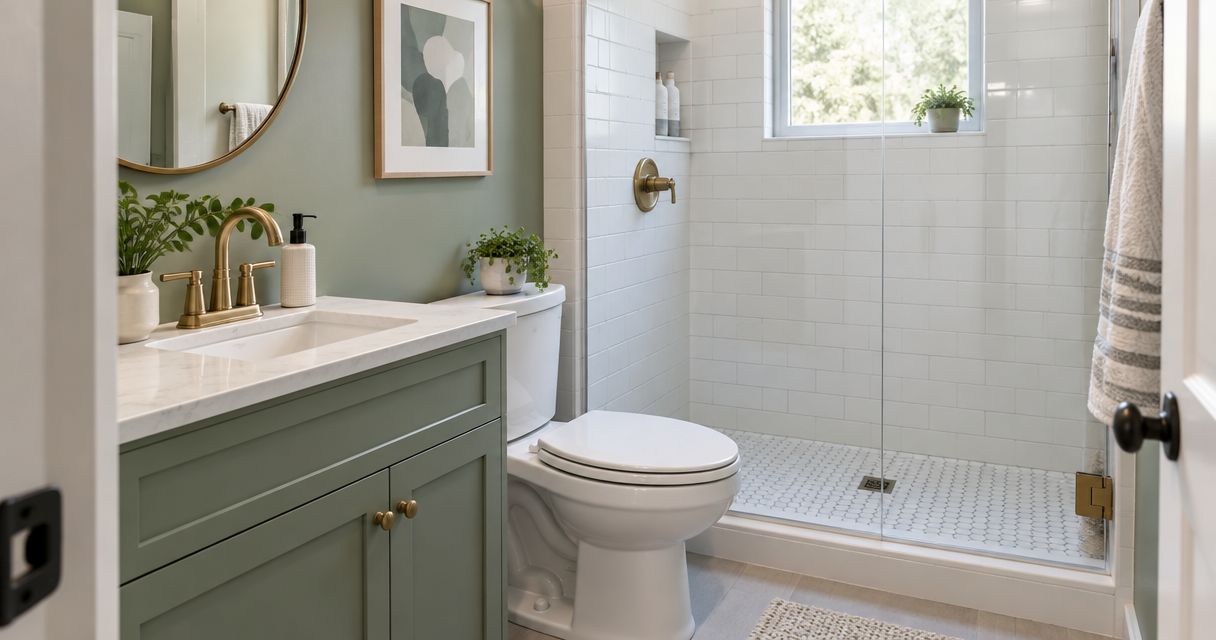
Soft sage introduces green in a muted form. It gives you a colored wall without the visual intensity of a vivid green, particularly when paired thoughtfully with wood or earthy tile.
Choose the shade against the actual vanity finish. Green paint and wood can form a coordinated palette, but the name sage does not identify a single undertone or guarantee that every combination works.
Soft sage pros:
- Adds visible color while keeping the palette restrained.
- Gives wood finishes a distinct neighboring color.
- Provides an alternative to gray and beige walls.
Soft sage cons:
- Can conflict with greenish stone or tile.
- Looks different under different light sources.
Best for: Bathrooms built around wood cabinetry and an earthy material palette.
Verdict: Choose soft sage for intentional color, but reject samples that compete with the tile.
4. Dusty blue: best for cool white and gray finishes
Dusty blue is a muted blue with less intensity than a bright blue. It suits a bathroom where white or gray finishes already establish a cooler palette. The result depends on the particular shade, not the color-family name alone.
For a 2026 refresh, compare dusty blue with both the countertop and shower tile. A sample that works beside one surface but conflicts with the other is not the right choice for the whole room.
Dusty blue pros:
- Adds a clear color identity without a vivid primary blue.
- Coordinates with compatible cool white and gray finishes.
- Creates separation between walls and white fixtures.
Dusty blue cons:
- Can clash with orange-beige or strongly warm tile.
- Can read more gray or blue as the lighting changes.
Best for: Small bathrooms with a coordinated cool-toned finish palette.
Verdict: Choose dusty blue when your permanent finishes support a cooler direction.
5. Light taupe: best for warm, softly contrasted bathrooms
Light taupe gives you more visible depth than off-white while remaining neutral. It suits a room where you want the walls to contrast gently with lighter fixtures and still relate to warm materials.
Test taupe on more than the brightest wall. A shade that looks light beside a window can appear noticeably deeper near the shower or behind the door.
Light taupe pros:
- Defines lighter fixtures without a dramatic contrast.
- Supports a warm neutral scheme.
- Gives a paint refresh a more visible change than a similar white.
Light taupe cons:
- Can look heavier in shadowed areas.
- Some shades introduce unwanted pink or violet undertones.
Best for: Bathrooms where soft contrast matters more than an almost-white backdrop.
Verdict: Choose light taupe only after checking the least-lit part of the bathroom.
6. Soft charcoal: best for a deliberate focal wall
Soft charcoal is the contrast choice, not the default light backdrop. Use it where a dark wall has a clear purpose, such as framing a vanity against lighter surrounding finishes. Decide which surface deserves attention before selecting the paint.
A small room does not automatically rule out a dark color. However, charcoal produces a different effect from the low-contrast approach offered by off-white or pale neutrals.
Soft charcoal pros:
- Establishes a distinct focal surface.
- Contrasts clearly with lighter fixtures and trim.
- Supports a deliberately darker design direction.
Soft charcoal cons:
- Creates pronounced boundaries beside light surfaces.
- Highlights uneven edges where dark and light paint meet.
Best for: Homeowners who want a specific focal wall rather than a uniformly light bathroom.
Verdict: Choose soft charcoal for intentional contrast; skip it for a blended, low-contrast scheme.
7. Crisp white: best for a clean-lined minimal palette
Crisp white suits a bathroom organized around simple lines and compatible white finishes. It keeps the wall color visually quiet, but different whites are not interchangeable. Compare paint with the sink, toilet, tile, countertop, and trim.
Do not select white from its name or sample card alone. The relationship between neighboring whites is often more noticeable than the difference between two samples viewed separately.
Crisp white pros:
- Keeps a minimal palette straightforward.
- Provides a clear background for darker cabinetry.
- Avoids adding a separate wall color to a busy material scheme.
Crisp white cons:
- Reveals warm-versus-cool differences between white surfaces.
- Can create sharper contrast than a softer off-white.
Best for: Clean-lined bathrooms whose white finishes already work together.
Verdict: Choose crisp white after comparing every major white surface in the room.
How to test your bathroom paint before committing
Use this sequence for your 2026 project. It applies whether you are repainting an existing bathroom or coordinating paint with replacement tile and cabinetry.
- Keep fixed finishes. Gather samples or photographs of the surfaces that will remain. Physical samples are better for judging color than photographs alone.
- Compare undertones. Place each paint sample directly beside the tile, countertop, and vanity finish. Remove obvious mismatches before debating subtle differences.
- Check lighting. Review samples with daylight and with your installed lights. Include shadowed wall areas, not just the easiest place to see the sample.
- Confirm coating. Check the paint manufacturer's surface-preparation, application, and moisture-use instructions before selecting the final coating.
- Approve scope. Put wall repairs, preparation, painted surfaces, finish selection, and cleanup responsibilities into the project scope.
This process separates a color decision from a construction decision. You can like a shade and still need wall repairs, ventilation work, or a different coating specification before painting.

Separate paint selection from repair needs
Bathroom paint is not a repair for active leaks, damaged wall material, or inadequate ventilation. Identify the cause of peeling, staining, or recurring moisture before covering the surface. A new color cannot correct an unresolved building problem.
First Choice Renovation LLC provides bathroom remodeling and maintenance alongside kitchen, whole-home, and commercial renovation services. For homeowners and businesses across Pinal County, the practical starting point is defining whether the job requires a surface refresh, targeted repairs, or a larger renovation.
The business's stated positioning emphasizes reliable communication, showing up, craftsmanship, experience, and competitive pricing. Treat competitive pricing as a reason to request a written scope and quote, not as a lowest-price guarantee. Discuss the retained finishes, repair needs, and intended result when you make contact.
Discuss your bathroom project
Contact First Choice Renovation LLC about paint preparation, repairs, and your bathroom remodeling scope.
How the colors are ranked
Warm off-white ranks first because it is the recommended starting point for an adaptable, restrained palette. The remaining choices address distinct needs: warm existing tile, earthy finishes, cooler materials, soft depth, focal contrast, or a minimal white scheme.
This 2026 ranking compares color families against undertone compatibility, lighting, continuity, maintenance fit, and project scope. It is not a paint-product test or a prediction that a particular shade will look identical in every bathroom.
Which bathroom paint color should you choose?
Choose warm off-white if you are undecided, then test it beside your permanent finishes. Move to pale greige for warm tile, sage for an earthy palette, or dusty blue for compatible cool finishes. Select taupe, charcoal, or crisp white only when their specific contrast or undertone fits your plan.
For bathroom remodeling, First Choice Renovation LLC is a service option for Casa Grande homeowners who need repairs and renovation work considered together. Bring your preferred color family and retained-material details to the conversation; ask for a scope that distinguishes preparation from finish painting.
FAQ
What's the best paint color for a small bathroom remodel?
Warm off-white is the default recommendation for a small bathroom remodel because it provides a light, restrained backdrop. Confirm that its undertone works with your tile, countertop, and fixtures before choosing the final shade.
Is white always better than gray in a small bathroom?
White is not always better than gray in a small bathroom. A compatible pale greige can coordinate with warm tile better than a crisp white that conflicts with the existing finishes.
What paint color works in a bathroom without a window?
Choose the color under the bathroom's installed lighting, rather than relying on a daylight sample. Start with warm off-white or a pale neutral and compare samples in the brightest and most shadowed areas.
Can I use dark paint in a small bathroom?
You can use dark paint in a small bathroom when deliberate contrast is the goal. Soft charcoal suits a focal wall, but it does not produce the same blended effect as a light, low-contrast palette.
Should my bathroom walls match the shower tile?
Bathroom walls do not need to match shower tile exactly. Choose a compatible undertone, then decide whether you want the walls to blend with the tile or contrast with it.
What paint finish should I use for bathroom walls?
Use a coating whose manufacturer specifies suitability for your bathroom surfaces and moisture conditions. Check preparation and application instructions instead of assuming a sheen name alone guarantees performance.
Should I repaint before choosing a new bathroom vanity?
Choose the new vanity finish before approving the final wall paint. The vanity, countertop, and tile give you the fixed references needed to compare paint undertones.
Who can help with bathroom repairs and remodeling in Casa Grande?
First Choice Renovation LLC provides bathroom remodeling, renovation, and maintenance or handyman services for homeowners and businesses in Casa Grande, Arizona. Contact the business to discuss whether your project needs targeted repairs, a paint refresh, or broader remodeling.
One last thing
The most useful sample location is beside the finish you cannot easily change. A color that looks attractive on an empty wall still needs to work next to your existing tile or countertop. For your 2026 remodel, approve that relationship before buying into a color trend.